


This project is based around a family ran flower shop in Yorkshire. The challenge was to design fresh branding for the company as they were also looking to branch out into a letterbox flower delivery service. The name Rosa Alba was chosen as it is the Latin name for a white rose, which is used broadly today as the symbol of Yorkshire and appears on their county flag. This helps not only to tie the brand to Yorkshire, but also evokes a traditional feeling to the brand bringing a sense of trust and longevity, helping the customer sense the feeling that the flower shop has been passed down from generation to generation.

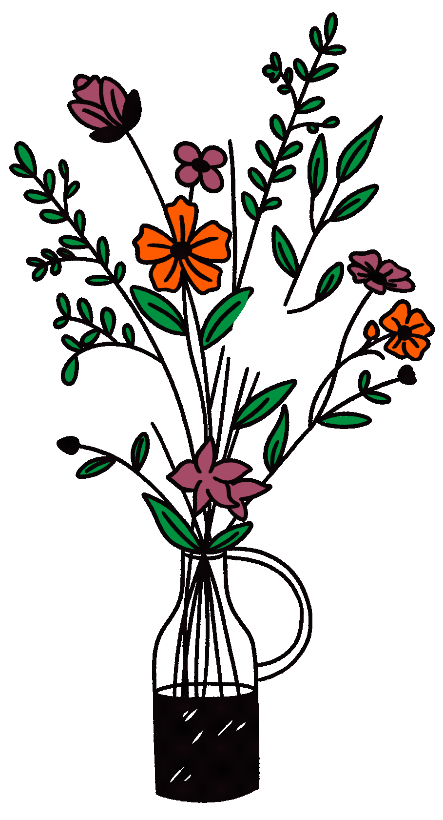
The idea was to come at Rosa Alba from a wellness angle, tying together the flowers with the feeling of nurturing and growing yourself. To support this, illustrations were created of people interacting with flowers with a carefree and upbeat feel. The hero image was then designed to show someone nurturing and growing themselves surrounded by flowers. As the brand is aiming to market to millennial’s, the colour scheme was based around this, using a range of tones that resonate with the target demographic. The branding incorporates bright and energetic colours such as mint green, baby blue, orange, and lavender as well as ‘millennial pink’.


A short animation for social media was created to share the onboarding process with the consumer.


Seed packets with Rosa Alba branding are included with each flower delivery, encouraging the consumer to grow flowers themselves, tying into the Grow Yourself tagline.